Spots: Step 4 - Comparing Data
Now that spot information has been extracted from the TLC plates it is time to investigate
and compare data. In each place where a graph or data grid is present in the control
views you can alter the data comparison to fit your needs.
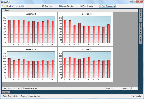
Go to the Plate Comparison ( ) control view by clicking on the Plate Comparison icon in the
toolbar. The view is displayed in the image below. ) control view by clicking on the Plate Comparison icon in the
toolbar. The view is displayed in the image below.
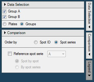
Open the Data Selection panel by clicking on the Data Selection button
in the right button bar. In the panel check the Groups radio button. This
lists your groups in the project. Make sure that both groups are checked.
Next, open the Comparison panel, located below the Data Selection
and change to order by Spot series as illustrated by the screen shot next
to this text. The bars in the graphs will be arranged according to the spot series
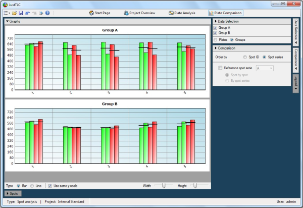
for the spots. The comparison view should look like the screen shot below.
We were hoping to find that all spots have the same volume, but there is an obvious
difference. Tick in the Reference spot series check box in the Comparison
panel. Make sure that you have spot series “A” selected as the reference and that
the radio button Spot by spot is checked.
The bars in the graphs now display the quotient between spot series “A” and “B”.
We notice that the difference between the spots has significantly decreased. In
a perfect world all graphs should have all the bars positioned at 1.0, but we are
not too far away!
We have shown that by using an internal standard (spot series "A") the measuring
accuracy will greatly improve. We have also shown that it is possible to compare
data between different TLC plates.
Lane Analysis
Spot Analysis
|